
Custom Band Tee Design: Create Music-Inspired Graphics
The band tee is one of the few pieces of clothing that works as a full personality statement. It says where you've been, what you listen to, and how you see yourself. Custom band tee design has crossed well beyond the concert floor: it's on runways, in streetwear drops, and tucked into midi skirts on people who've never set foot near a mosh pit. That crossover happened because the aesthetic carries real cultural weight. This guide breaks down how to harness that look for yourself, no licensing deal required.
Why the Band Tee Aesthetic Hits Different
A band tee is shorthand. You put one on and you've already told the room something: your taste, your era, your tribe. That signal is more loaded than almost any other garment in the casual wardrobe.
The band tee aesthetic has traveled a long way from its origins on concert floors in the 1970s and 80s. By the 2010s it had been absorbed into high fashion, oversized, distressed, and deliberately beaten up. In 2026 it lives equally in archive vintage stores and fast-fashion hauls. The look isn't about any single band anymore. It's about music as personality armor.
That's the real reason people search for music graphic tees who've never owned "official" merch in their lives. They want the visual language, not the logo. Understanding that is the starting point for designing something that actually works.
What Makes a Custom Band Tee Design Work Visually
The genre has a clear visual grammar. Get these elements right and the shirt reads as intentional; get them wrong and it just looks like a misprint.
Typography and distressed type treatments
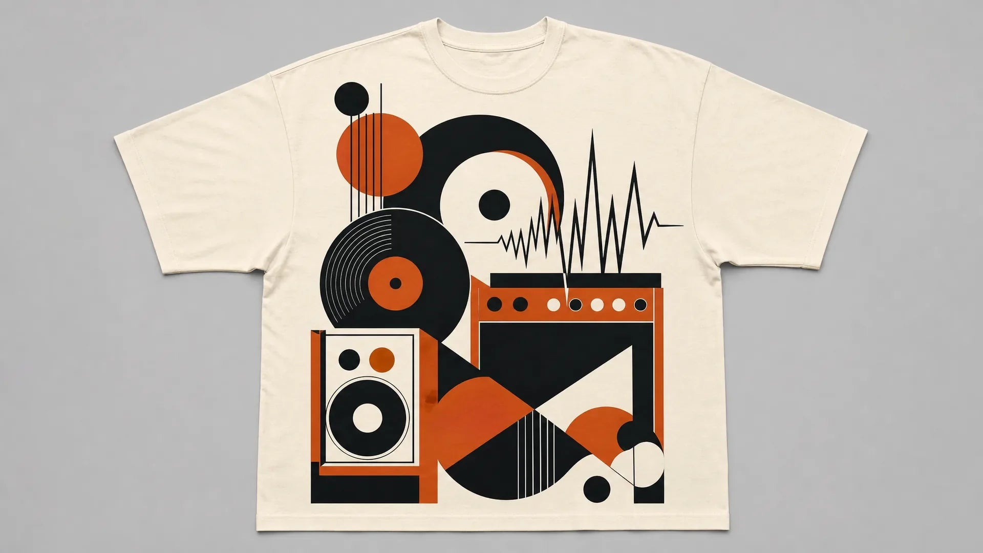
Oversized serif fonts, often condensed, sometimes blackletter, are the backbone of the format. Think bold, high-contrast type that fills the chest. Tour-era graphics leaned heavily on hand-drawn lettering and wood-type printing styles, which gave them natural irregularities. For a modern custom band tee design, replicating that means choosing rough-edged type over clean sans-serifs and letting ink bleed or edge-distress do the work.
The "tour date stack" is one of the most borrowed layouts in all of streetwear: band name large across the chest, a list of city names and venues running down the back. Vetements turned this convention into a high-fashion statement with their SS2016 tourist collections, and fast-fashion brands have copied the structure endlessly since. The layout is now entirely decoupled from any real tour, it's a design format, not a band-specific asset.
Merch art directors in the music industry point to rough-edged typography, limited color palettes of two to four colors, and deliberate "aging" effects like halftone dots or ink bleed. None of those conventions are proprietary to any single artist. They're a shared visual vocabulary, and that means they're yours to use.
Vintage-inspired color palettes and washed-out effects
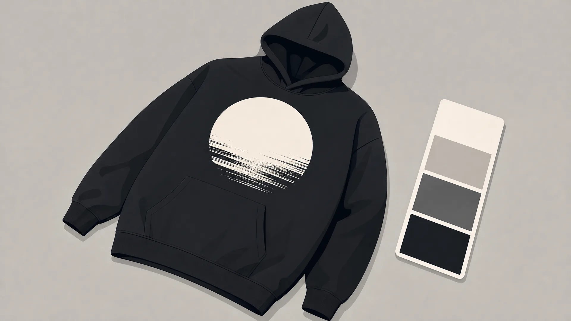
The grunge and metal subcultures of the late 1980s and early 1990s made deliberately worn, faded, and bleached tees a cultural signature. What was once a byproduct of age and washing is now a deliberate design choice. Washed-out ochres, dusty reds, faded black, and off-white grounds communicate "this has history" even when the shirt is brand new.
Keep your palette tight. Two to three ink colors on a faded or pigment-dyed base almost always outperform full-color prints for the vintage band shirt style. The constraint is part of the aesthetic, it mimics the limitations of old screen-print runs.
The Difference Between Official Merch and Music-Inspired Apparel
Here's where a lot of people searching "custom band tee design" run into a wall, and it's worth being direct about it.
Designing a shirt that uses a real band's name, logo, or album artwork without authorization is an intellectual property issue. Brands like Nirvana, Metallica, and the Rolling Stones have all pursued legal action against unlicensed use of their imagery. It's not an ethical grey area. It's an active legal risk.
But designing something inspired by a music era, genre, or subculture? That's entirely fair game. A shirt that pulls from 90s grunge visual codes, the color palette, the distressed type, the heavy graphic, is music-inspired apparel, not a licensed product. The aesthetic belongs to a culture, not a corporation.
That distinction is what makes the DIY and print-on-demand space viable. You're not copying a band. You're fluent in a visual language, and you're using it to say something about yourself.
Building Your Own Music Apparel Design: A Practical Framework
You don't need a design degree to nail the music apparel look. You need a clear identity anchor and the right translation choices.
Choose your music identity anchor (genre, era, subculture)
Start with a single, specific answer to: what does my music taste actually look like? Not "I like rock." More like: "I'm into late-90s Pacific Northwest post-grunge" or "I live in the 2000s metalcore era" or "I'm a classic soul obsessive."
The more specific your anchor, the stronger the design direction. Each subculture and era has its own visual signature:
- 90s grunge/alt-rock: torn edges, photocopied imagery, desaturated earth tones, Courier-style type
- 80s/90s metal: blackletter fonts, high contrast, skulls and occult geometric imagery, black with white or red
- 70s classic rock: psychedelic curves, faded gold and brown, swirling type
- 2000s emo/hardcore: angular type, stark black-and-white, stark contrast
- Soul/funk/R&B: bold block type, warm oranges and browns, retro badge layouts
Pick your lane. Mixing these usually muddies the result.
Translate it into graphic tee elements
Once you have your anchor, map it to four design decisions: imagery, font style, color, and placement.
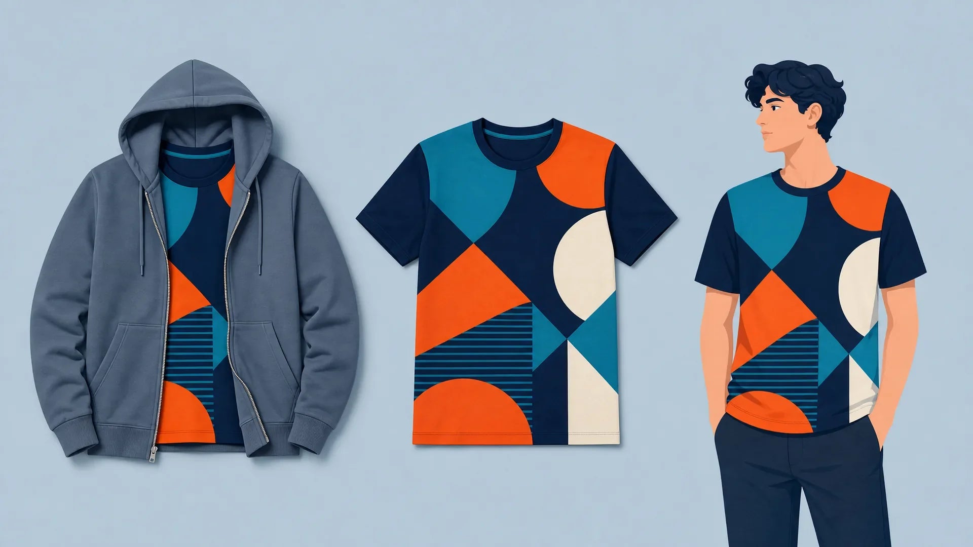
Imagery should reinforce the subculture shorthand without using any real artist's work. A guitar silhouette, a vintage amplifier outline, a lightning bolt, or abstract geometric forms all carry music energy without legal exposure. Photographic treatments, halftone-converted images, high-contrast duotones, add the vintage band shirt feel without requiring original photography.
Font style should match the era. Metal gets blackletter or condensed heavy serif. Grunge gets irregular, photocopied-looking type. Soul gets wide, geometric display fonts from the 60s and 70s. Mixing a headline font with a secondary condensed font for supporting text (the "venue stack" convention) adds depth.
Color should be limited and purposeful. Pick a base shirt color that reads as aged, faded black, washed grey, dusty rose, vintage white. Add one or two ink colors, max. Full-color renders break the aesthetic.
Placement follows music merch conventions: dominant chest graphic, secondary back print (the tour stack or a graphic repeat), and optionally a small sleeve hit. This three-zone layout is what separates music-inspired apparel from a generic graphic tee.
Concert Tee Alternatives Worth Wearing Every Day
Official band merch is one option. It's not the only one, and for most people who love the aesthetic, it's not even the best one.
Print-on-demand has made genuine concert tee alternatives accessible to anyone. No minimums, no bulk orders, no warehousing. You design something that's actually yours, built around your specific taste, and it ships as a single item.
At Tenino Ventures, our print-on-demand model means every music-inspired graphic tee is made to order. No leftover stock, no minimum run. You get the custom band tee aesthetic without any band's legal team getting involved. That's the whole point.
If you want to push the look further, all-over print custom designs carry the same music-era energy into a format that hits harder, full-coverage graphics that feel more like wearable art than merch.
For those starting from scratch, exploring bold graphic tees for men gives you a strong reference point for how the visual language scales across different styles.
The advantage of going custom isn't just legal safety, it's that the shirt actually represents you, not just your record collection.
Styling the Band Tee Aesthetic in 2026
The band tee aesthetic is at its strongest when it's worn with intention, not irony. A few directions that are working right now:
Oversized with wide-leg denim. The proportions echo the 90s without cosplaying them. Heavy boots or chunky sneakers finish it.
Layered under a flannel or overshirt. Left open, sleeves rolled. The graphic peeks through, that's the whole point.
Tucked into a midi skirt. Front-tuck, slightly bloused. Mixes the band tee's rough edge with something more constructed. Unexpected and it works.
Stacked under a leather or denim jacket. Classic for a reason. The jacket should read lived-in, not pristine.
The through-line across all of these: don't over-style it. The music graphic tee is the statement. Everything else supports it.
If the band tee look is your thing, we make stuff built for exactly that, see what's in the drop.
Leave a comment
This site is protected by hCaptcha and the hCaptcha Privacy Policy and Terms of Service apply.