
Oversized Graphic Hoodie Design Guide
Most design guides for hoodies spend three paragraphs on DPI settings before they mention what the thing should actually look like. That's backwards. The best oversized graphic hoodie design starts with a clear visual point of view, a feeling, a stance, a statement, and the tools follow. If you nail the aesthetic principles, the software is just execution.
This guide is about those principles. How the oversized silhouette changes what graphic design has to do. Where to place a print to land with maximum impact. How contrast, scale, and negative space work together. And how to make a hoodie feel like an identity piece, not just fabric with an image on it.
Why Aesthetic Principles Beat Tools Every Time
Knowing Photoshop doesn't make you a better designer. Having a point of view does.
Technical skill is table stakes. What separates a forgettable hoodie from a statement piece is intentionality, every visual choice made with a reason. The color palette, the size of the graphic, the breathing room around it, the typeface. These are aesthetic decisions, not software decisions.
The designers who consistently produce work that turns heads aren't necessarily the most technically fluent. They're the ones who made a clear choice and committed to it. One strong idea, fully executed, beats five competing ideas every time.
So before you open any design app, ask yourself: what is this hoodie for? Not the product category, the feeling. Defiance? Reverence? Humor? That answer shapes everything downstream.
The Oversized Hoodie as a Design Canvas
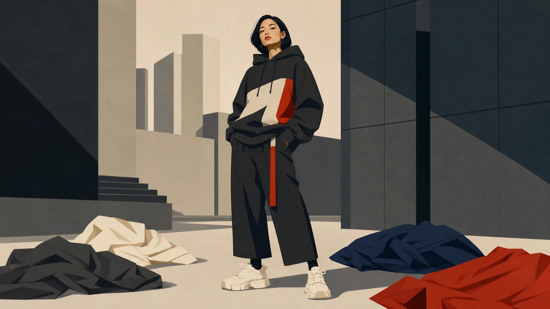
An oversized hoodie isn't a big t-shirt. The silhouette, the weight, the way it falls, all of it changes what your graphic has to do.
Why Scale Changes Everything
On a standard fitted tee, a chest graphic sits roughly centered on a predictable flat plane. On an oversized hoodie, drop shoulders push the chest panel wider and lower. The torso blooms outward. Fabric folds and gathers in unpredictable places.
That means a graphic that looks perfectly balanced in a flat mockup can read as cramped or misaligned on an actual body. Apparel designers who work in this space consistently flag the hoodie as the hardest garment to design for, because it's viewed in three dimensions. The wearer moves, the fabric shifts, and a static composition designed for a screen can look clumsy in motion.
Design for the body, not the mockup.
Fabric, Drape, and How They Shape Your Graphic
Heavier fleece holds its structure. The graphic lands close to where you placed it. Lighter, more fluid fabrics drape and shift, which can work for you if you account for it, or against you if you don't.
Wrap-around graphics and all-over print hoodie design techniques particularly reward heavier fabric because the full-surface design needs consistent registration across panels. All-over print, where front, back, sleeves, and hood are treated as a single unified canvas rather than separate placement zones, is a named technique in custom apparel and streetwear, distinct from placement printing. It's a higher-complexity execution, but it opens up visual possibilities that placement printing can't touch.
Graphic Placement on Hoodies: Where Bold Lives
Graphic placement on hoodies is one of the highest-leverage decisions in the whole design process. Before you finalize any artwork, know where it's going, because location changes meaning.
Chest, Back, and Sleeve, Knowing What Each Zone Says
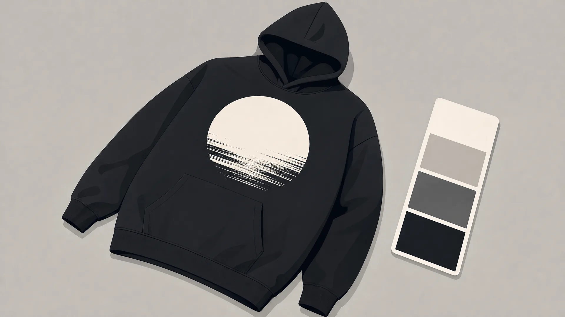
Chest placement reads as identity. It's the first thing people see face-to-face. It signals affiliation, attitude, or allegiance, which is why logos, icons, and short statements work well here. Keep it decisive; chest graphics that try to do too much feel cluttered at conversational distance.
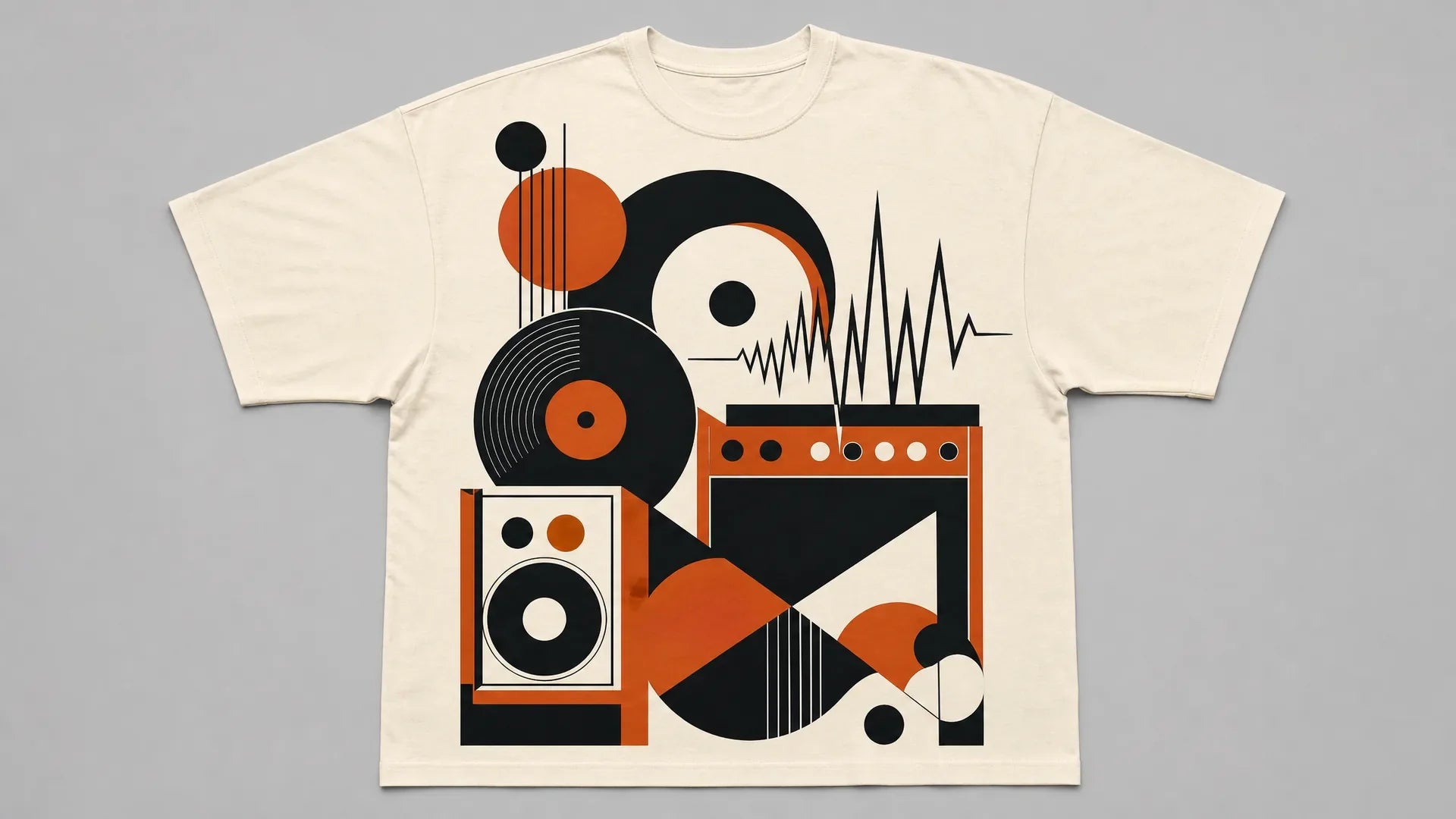
Full-back placement reads as proclamation. You're broadcasting to everyone behind you. This zone handles scale well, a large, bold print across the full back creates visual impact that chest placement simply can't match. It's also where narrative graphics, panoramic imagery, and typographic statements earn their real estate.
Sleeve placement signals intentionality. It's unexpected enough to read as designed rather than templated. A single word, a stripe, a symbol running down the sleeve, small gestures that reward close attention without competing with a primary graphic.
Breaking the Grid: Off-Center and Wrap-Around Placement
Centered graphics are comfortable. They're also easy to ignore.
Off-center placement, a chest graphic shifted deliberately to one side, or a back print that bleeds toward a shoulder, signals that someone made a choice. Brands like Supreme built early cultural recognition partly through the disciplined placement of a single box logo. The restraint was the statement. Placement conviction outperforms visual clutter.
Wrap-around placement takes that further. A graphic that starts on the front, crosses a sleeve seam, and continues on the back treats the garment as a three-dimensional object, because it is one. This is where all-over print and strong hoodie design inspiration intersect most powerfully.
Bold Print Design Ideas: Building Visual Impact
Great bold print design ideas aren't complicated. They're disciplined. A few core aesthetic levers, used with conviction, do more than a maximalist pile of elements ever will.
Contrast, Scale, and Negative Space
Contrast is your most immediate tool. High-contrast pairings, black on white, a saturated color on a dark field, read from distance and hold up in motion. In 2026, independent apparel leans hard toward maximalist all-over graphics and high-contrast treatments, a direct reaction to years of minimalist "quiet luxury" fashion. Understanding that moment helps you position a statement piece, you can lean into the swing or deliberately cut against it.
Scale creates hierarchy. An intentionally oversized motif commands attention; an intentionally tiny one creates intrigue and rewards proximity. What you don't want is accidental scale, a graphic that's medium-sized for no reason, neither bold nor subtle.
Negative space is where most non-designers underinvest. Breathing room around a graphic makes it land harder, not softer. Crowding a design to fill every inch of fabric dilutes every element in it. Restraint is a power move.
The same principles apply whether you're designing bold graphic tee design principles for men or scaling up for a full oversized hoodie, but the hoodie's larger canvas punishes visual noise more harshly.
Typography as a Graphic Element
Type-driven graphics function as pure visual weight, not just messaging. A single word set in a heavy display typeface, stretched to the full width of a back panel, isn't primarily communicating its semantic meaning, it's creating mass, texture, and presence.
Distorted letterforms, stacked type, condensed or expanded characters, these are graphic tools. A slogan matters less than how it sits on the fabric. When you're working with statement hoodie creation, treat every typographic choice as a composition decision first, a language decision second.
Oversized Hoodie Design Tips: From Concept to Cohesion
Here's a practical process that doesn't require a design degree.
Starting With a Mood, Not a Sketch
Don't open a drawing tool first. Open a folder and start collecting images, photography, art, signage, textures, anything that carries the feeling you're going for. Build a reference set of 10–20 images. Then look at what they have in common.
That shared visual language, the palette, the weight, the energy, is your design brief. You're not copying; you're calibrating your eye to the emotional register you want the hoodie to occupy. This is how professional designers work, and it's the fastest way to develop a coherent point of view without formal training.
These oversized hoodie design tips apply regardless of experience level: mood before mockup, feeling before form.
Testing Your Design at Actual Scale
This step gets skipped constantly, and it's where good designs become bad hoodies.
A graphic that looks balanced at thumbnail size, in your design software, in a browser preview, often falls apart at 20 inches wide on an actual garment. Elements that seemed proportional become too small to read or too large to coexist. Spacing that looked generous becomes either cramped or wasteful.
Before you finalize, mock the design at full garment scale. Print it out on paper and hold it against a hoodie. Use a large-format mockup at 1:1 dimensions on screen. Walk away, come back, and look at it fresh. You're checking whether the design reads the way you intended, not just whether it's technically correct.
Statement Hoodie Creation: Turning a Design Into an Identity Piece
A great statement piece has one coherent point of view. Not five ideas competing for the same real estate, one idea, executed with enough conviction that it couldn't have been accidental.
That coherence is what makes a hoodie feel like an identity piece instead of fabric with a graphic on it. The placement choice, the scale, the contrast, the type treatment, they all pull in the same direction. When someone sees it, they don't just see a design. They see a stance.
This is the core of oversized graphic hoodie design done right: every decision answers to the same central idea.
At Tenino Ventures, our all-over print hoodies are produced on demand, every design is printed fresh, with no bulk inventory forcing compromises on color vibrancy or graphic precision. That model directly rewards bold, high-contrast designs that would be costly or risky to stock at scale. You get the full canvas, the full color range, and none of the hedging.
If you're done theorizing and ready to wear the thing, build yours here. The principles are in your hands. Now use them.
Leave a comment
This site is protected by hCaptcha and the hCaptcha Privacy Policy and Terms of Service apply.