
Minimalist Phone Case Print on Demand: A Practical Guide for Creators
Ever stared at your phone, wishing the case could be sleek enough to match your calm morning routine, yet still protect that pricey device? You’re not alone. A lot of mums, dads, teachers, and nurses tell us they crave that minimalist vibe – something that says ‘I’m organized’ without shouting.
That’s where minimalist phone case print on demand steps in. Instead of hunting down a generic case that looks like everyone else’s, you can design a clean, subtle pattern that reflects your personal style. Think a single line drawing, a muted pastel hue, or even a tiny inspirational word that only you notice.
In our experience, the magic happens when you blend simplicity with quality. A thin, matte finish feels premium, while a subtle texture adds a tactile reminder of why you chose minimalism in the first place. And because it’s print on demand, you avoid bulk inventory – each case is made just for you when you order it.
Picture this: a busy teacher juggling lesson plans, grading, and a quick coffee break. She slips her phone into a case that’s barely there, yet it protects against the inevitable drops in the staffroom. Or a nurse on a hectic shift, needing a case that won’t snag on gloves, with a calm, neutral tone that doesn’t draw unnecessary attention.
But how do you start? First, sketch a simple concept – even a single shape can become a statement. Then, choose a POD platform that offers high‑resolution printing on slim phone shells. Finally, test a few samples; the feel in your hand is the ultimate judge.
If you’re curious about translating that minimalist mindset to other products, check out how to create and sell a print on demand funny coffee mug that stands out. The design principles are the same: less is more, and quality matters.
So, ready to ditch the cluttered cases and embrace a clean, protective aesthetic? Let’s dive deeper into the steps, tools, and tips that will help you launch your own minimalist phone case line without the headache of traditional inventory.
TL;DR
Minimalist phone case print on demand lets you create sleek, protective cases without inventory, perfect for busy moms, dads, teachers, and nurses who value simplicity. Start with a single‑line design, choose a POD platform, order a sample, and watch your clean, custom case sell while you focus on what matters.
Step 1: Choose the Right POD Platform
Alright, you’ve got that sleek line‑drawing in mind and you’re ready to turn it into a phone case that feels like an extension of your own calm. The first big decision? Picking the print‑on‑demand platform that will actually bring that minimalist vision to life without turning it into a nightmare.
When I first started helping teachers and nurses get their own cases, the platform choice made the difference between a case that snapped together perfectly and one that felt cheap and flimsy. So, let’s break down what really matters.
What to Look For
Print quality. You want a high‑resolution printer that can reproduce that single‑line art without any fuzzy edges. Look for DPI numbers in the 300+ range and a reputation for colour‑accurate output.
Case material. Minimalist fans love a thin, matte finish that slides onto the phone without adding bulk. Some platforms only offer polycarbonate; others give you a choice between polycarbonate and TPU. Choose the one that feels light but still protects against everyday drops.
Sample workflow. A good POD service will let you order a single sample before you commit to listing. That way you can feel the texture, test the grip, and see if the print aligns with the phone’s cut‑outs.
Integration with your shop. If you’re already selling on Etsy, the platform should sync orders automatically. No one wants to copy‑paste order numbers into another dashboard every night.
And don’t forget shipping speed. Busy parents and nurses appreciate a platform that can ship within a few days, not a two‑week lag that makes you look unreliable.
Here’s a quick checklist you can print out (or just keep on your phone) when you’re scouting options:
- Resolution ≥ 300 DPI
- Thin, matte case material
- Sample order available
- Etsy integration
- Standard shipping < 5 days
Got that list? Great. Now let’s see a couple of platforms that consistently check those boxes.

One of the platforms we frequently recommend is Printful. They offer a thin matte case that’s compatible with most major phone models, and their mock‑up generator is straightforward. Their integration with Etsy works like a charm, and you can order a sample for under $10.
Another solid option is Gooten. They have a slightly larger catalogue of case styles, which is handy if you ever want to branch out beyond the ultra‑thin matte look. Their shipping times are comparable, and they also provide a reliable API if you ever decide to automate further.
Both services let you upload transparent PNGs, so your single‑line art stays crisp. If you’re wondering which to pick, ask yourself: do I need the simplest setup (Printful) or a bit more variety for future experiments (Gooten)?
Below is a short video that walks through the step‑by‑step process of uploading your design to a POD platform and ordering a sample. It’s a handy visual reference if you’re more of a “see‑it‑do‑it” kind of person.
After you’ve placed that sample order, give the case a real‑world test. Slip it onto your own phone, press the buttons, snap a photo of the design, and see how it looks in everyday light. If it feels right, you’re ready to list.
In our experience, taking the time to compare a couple of platforms up front saves you from re‑ordering, re‑designing, and most importantly, from disappointing the very people you’re trying to serve – busy moms, dads, teachers, and nurses who just want a case that works and looks good.
So, grab that checklist, order a sample from your top‑two picks, and let the quality speak for itself. Once you’ve nailed the platform, the rest of the process – from design tweaks to marketing – becomes a lot smoother.
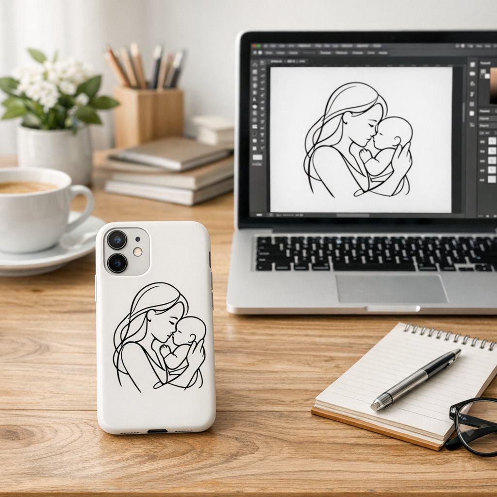
Step 2: Design Minimalist Artwork That Sells
Let’s be honest: minimalist design isn’t about removing personality. It’s about clarity that actually lands with your audience, especially busy moms, dads, teachers, and nurses who want calm, reliable gear. If the case looks crisp and prints cleanly on day one, you’ve already won half the battle. In our experience, the simplest ideas travel the farthest. That’s the magic of minimalist phone case print on demand.
Think of a concept you can defend in a sentence—one line, one shape, one tiny symbol that carries meaning. Here’s what that looks like in practice: a single curved line suggesting movement, or a tiny word that only shows when you glance closely. The goal is to create something that feels intentional, not decorative.
Start with a simple concept
Begin with a statement you can explain on a coffee break. If you can tell someone in under 10 seconds why this design matters, you’re on the right track. This is where most successful minimalist cases start: a memorable but subtle idea that can scale across multiple shell colors and sizes.
Keep the idea tightly scoped. If a design needs a backstory, you’ve probably overcomplicated it. You want something that translates well in small print and on screen proofs alike.
Nail crisp lines and alignment
Minimalism lives or dies by precision. Your line work should stay perfectly centered and the edges must be clean. Order a few samples and check for any softness in the lines or misalignment that only shows up on the physical shell. It’s the difference between "premium" and "yeah, close enough."
Tip: design in vector whenever possible and preview at true shell size. If you can’t, export at the highest practical resolution and verify edge curvature against a sample shell.
Limit your color palette
Less is more here. Pick two to four hues that work in harmony with your underlying shell color. Neutrals like charcoal, sand, and ivory often pair best with a matte finish that hides fingerprints. If you’re testing color, print proof against both white and black shells to see how contrast holds.
Think about mood: a soft gray with a whisper of blue feels calm; a warm taupe can feel approachable. You’ll want consistency across your catalog so customers build recognition quickly.
Texture, finish, and printing compatibility
A matte finish often screams premium in minimalist aesthetics. It also handles fingerprints better than gloss. But test both options on your chosen printer to see how subtle textures interact with line work and negative space. The case should feel like it’s an extension of the phone, not a separate accessory.
Remember to keep your textures delicate. Heavy textures can distract from the clean line art and ruin the minimalist promise.
Typography and small details
If your design uses a word or initials, ensure legibility at small sizes. Choose a font with clean, geometric shapes and avoid overly decorative serifs. Position lettering so it aligns with the shell’s natural centers and doesn’t crowd the camera or buttons.
Small details matter—tiny misalignments feel amplified on a phone that’s always in use. Precision earns trust with teachers who need a design that looks deliberate on the desk and in the staff lounge chatter.
File setup and export tips
Deliverables should be ready for print: vector files for lines where possible, or high-resolution PNGs with a transparent background. Use sRGB, 300 dpi or higher where applicable, and export with a safe margin to accommodate edge curvature. Name files consistently so designers and suppliers stay aligned.
Include a quick spec sheet: shell thickness, color profile, and centering tolerances. If you keep a single source of truth, misprints drop dramatically and your launch goes smoother.
Test and iterate
Design is a conversation, not a one-off decision. Order 2–4 samples, compare them side by side, and note any shifts in color or line sharpness. Let every sample inform small tweaks before you commit to a broader run. Your future self will thank you for the extra few days of testing.
Consider gathering feedback from your target audience—parents who juggle kids and devices, or nurses who wear gloves and bustle through shifts. Real-world wear often reveals edge cases you hadn’t imagined.
Incorporating all this isn’t about vanity; it’s about confidence that your minimalist artwork will sell. If you want a tangible example of how these decisions play out, check our minimalist case samples.
Step 3: Set Up Your Online Store and Listings
So you’ve got the concept, you’ve seen it printed crisp on a sample. Now the real work begins: setting up a storefront that feels calm and reliable for busy moms, dads, teachers, and nurses. The goal is a frictionless shopping experience where the minimalist phone case print on demand actually sells itself.
Start with a clean store layout. Keep navigation simple: one primary category for phone cases, then small subcategories by shell color or finish. Use clear product bullets and big, honest photos that show the matte texture and slim profile. Think about how the case looks in a hand and in a pocket.
Title and description matter more than you think. A good title stacks keywords without sounding robotic. In the description, lead with the benefit: protection that disappears in your day, not intrudes on it. Then list materials, print quality, and care. End with shipping times and a simple return policy.
Visuals matter. Use high-resolution mockups that show edge crispness. If you can, include a lifestyle shot—someone juggling tasks, a coffee break, a quick moment in a staff lounge. These tiny cues help your reader picture themselves using the case.
Pricing and variants should be straightforward. Start with a core set of shells (say, three colors) and two finishes (matte and soft gloss). Keep pricing consistent across variants unless you’re testing. In our experience, listings that clearly show the difference between finishes convert better.
Does this really work? Yes, when you keep it human and specific to your audience—moms, dads, teachers, and nurses—the right listing gets found and clicked. Be explicit about production times and how color shifts can occur with print on demand, so there are no surprises at delivery.
Policies that reduce friction pay off. Be clear about shipping windows, handling times, and returns. Busy professionals don’t want to chase delays or vague promises. A simple, honest policy reduces support requests and builds trust.
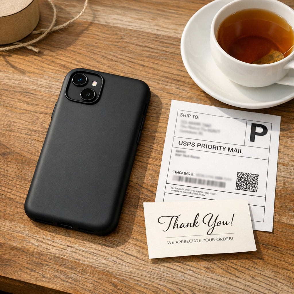
Photography, packaging, and unboxing matter. Even small touches—a tidy box, a thank-you note, a crisp card—make customers feel cared for. If you offer bundles (case + screen protector), describe the savings clearly. It’s the little details that push a hesitant shopper over the edge.
So, what should you do next? Create a listing template and a product spec sheet for designers. Use the template for every new design so typography, alignment, and margins stay consistent across your store. And test a live order or two before you publish widely.
Platforms like TeninoVentures help with print-on-demand fulfillment, so you can focus on your designs.
For a tangible example of how we present minimalist designs, check our minimalist case samples.
Start now. Your minimalist line can grow with care.
Step 4: Pricing, Production, and Shipping – A Quick Comparison
Now that your designs are crystal‑clear and your POD platform is chosen, it’s time to talk money, timelines, and how the product gets from the printer to your customer’s hand. This is where a lot of creators trip up – they either underprice and burn out, or overprice and lose sales before they even start.
First, ask yourself: what does a busy mom or a night‑shift nurse really care about? They want a price that feels fair, a production window that fits a hectic schedule, and a shipping experience that doesn’t add another to‑do item.
Pricing basics you can actually use
Start with the base cost you pay the POD partner for a single case – usually a slim matte shell plus the print. Add your desired profit margin (most creators aim for 30‑50%). Don’t forget fees: Etsy transaction fees, payment processor fees, and any optional packaging upgrades.
Tip: build a simple spreadsheet that auto‑calculates the final retail price once you input the base cost. That way you can quickly see how a change in production cost or a discount code affects your margin.
Production speed – what’s realistic?
Print‑on‑demand isn’t instant. Typical production times range from 1‑3 business days for a single case to 5‑7 days for bulk orders or custom finishes. If you promise “2‑day production” but the printer needs five, you’ll get angry emails and returns.
What we’ve seen work best is to set a realistic window (e.g., “Ships in 3‑5 business days”) and then add a buffer for holidays or peak seasons. Update the window in your shop policy – it builds trust and cuts support tickets.
Shipping options that matter to your audience
Most POD partners offer a few shipping tiers: standard (4‑7 days), expedited (2‑3 days), and international. For teachers and nurses, standard is usually enough – they’re not waiting for a birthday gift. For moms buying a gift, offering a cheap expedited option can be a conversion booster.
Remember to factor in the cost of tracking. Free shipping is a great hook, but you need to absorb the expense somewhere, usually in the product price.
Quick side‑by‑side comparison
| Factor | Option A: Basic POD | Option B: Premium POD (Matte Finish + Custom Packaging) |
|---|---|---|
| Base Cost per Case | $8.50 | $10.20 |
| Production Time | 2‑3 business days | 1‑2 business days |
| Shipping (US) | Standard $4.99, Expedited $9.99 | Standard $5.99 (includes tracking), Expedited $11.99 |
So, which line should you start with? If you’re just testing the market, stick with the basic POD option – lower cost, decent speed, and you can still offer a neat unboxing note. As demand grows, upgrade to the premium tier for faster turnaround and a more polished brand feel.
Here’s a quick checklist you can copy‑paste into your workflow:
- Calculate base cost + fees = minimum viable price.
- Set profit margin (30‑50%).
- Choose realistic production window; add a 1‑day buffer.
- Pick shipping tiers that match your audience’s urgency.
- Update shop policies with clear timelines and tracking info.
If you want to dive deeper into POD pricing strategy and see how other creators balance cost and quality, read our guide on pricing funny coffee mugs – the principles translate directly to phone cases.
And don’t forget the little things that turn a transaction into a delight: a thank‑you card printed on recycled paper, a protective sleeve tucked into the box, or a short “Your case arrived, enjoy the calm” note. Those touches cost pennies but add perceived value.
Bottom line: be transparent, be realistic, and give yourself a margin that lets you reinvest in new designs. When the numbers line up, you can focus on what you love – creating minimalist art that makes busy lives a bit smoother.
Step 5: Marketing Your Minimalist Cases on Social Media
Alright, you’ve got the perfect matte shell, a clean line drawing, and a price that feels fair. Now the real magic happens when you share it with the world. Social media isn’t just a billboard – it’s a place where busy mums, dads, teachers, and nurses scroll between lesson plans, patient notes, and bedtime stories. If you speak their language, they’ll stop, look, and maybe even buy.
Pick the platform that matches the habit
First, ask yourself: where does your audience spend a few minutes between a coffee break and a class? Instagram’s visual grid, Pinterest’s idea‑board vibe, and Facebook’s community groups all have a role. For minimalist cases, Instagram Stories and Reels let you showcase the case’s slim profile in 15‑second bursts – perfect for a teacher flipping a phone to check a schedule.
But don’t feel you have to be everywhere. Start with one or two platforms you can maintain consistently. A weekly carousel on Instagram paired with a monthly Pin on Pinterest often does the trick.
Show, don’t just tell
People love seeing the case in real life. Snap a quick video of the case sliding onto a phone while you’re brewing tea – the gentle clack, the matte finish catching the light. Pair that with a short caption: “Just the right amount of calm for a busy morning.” Notice the rhythm? A punchy opening, a relatable scenario, then the benefit.
And don’t forget user‑generated content. Encourage customers to tag #TeninoCalmCase when they place the case on a desk, in a gym locker, or next to a stethoscope. Re‑post those moments; it tells new visitors, “real people, real routines, real love.”
Craft a story‑driven post
Every post should feel like a mini‑conversation. Start with a feeling – “Ever feel like your phone is the loudest thing in the room?” – then slide into the solution. You might write, “Our minimalist case strips away the noise, letting you focus on the task at hand.” Finish with a gentle nudge: “Tap the link in bio to add a touch of calm to your day.”
If you need inspiration on turning a product into a story, learn how to craft a story‑driven post that resonates.
Use hashtags that actually reach
Hashtags are the breadcrumbs that guide busy professionals to your post. Combine broad tags (#MinimalistDesign, #PhoneCase) with niche ones (#TeacherLife, #NurseGear). A quick tip: search the “Recent” tab for each hashtag and note the engagement levels. Drop the ones that consistently show likes and comments.
Remember, quality beats quantity. Ten to fifteen well‑chosen tags usually outperform a wall of twenty‑odd random ones.
Leverage the power of carousel and carousel ads
Carousel posts let you break the story into steps: 1) the problem (cluttered phone accessories), 2) the design (single line, matte finish), 3) the feel (slip‑on, weightless), 4) the lifestyle (mom juggling toys, dad on a video call, nurse on a night shift). Each swipe feels like a mini‑journey.
If you’re comfortable spending a bit on ads, boost the carousel to a look‑alike audience based on past purchasers. It’s a low‑budget way to let the algorithm do the heavy lifting.
Schedule, test, and refine
Consistency builds trust. Use a free planner like Later or Buffer to schedule posts at times when your audience is most active – early mornings for teachers, late evenings for parents, mid‑shifts for nurses. Track which captions, images, or video lengths get the most saves and comments.
After a week, note the top‑performing post. Replicate its tone, but change the visual. Over time you’ll develop a formula that feels fresh yet familiar.
Wrap up with a clear call‑to‑action
Every piece of content should end with a tiny invitation. “Grab yours before the week’s rush” or “Tap to shop the calm collection.” Keep it low‑pressure; you’re offering a solution, not a hard sell.
So, what’s the next step? Choose one platform, film a 15‑second Reel of the case slipping onto a phone, add a relatable caption, and schedule it for tomorrow morning. Watch the comments roll in, respond like you would to a friend, and let the momentum grow. Social media is a conversation – the more authentic you sound, the more likely busy professionals will pause, appreciate, and buy.
Additional Resources and Tools
When you’re juggling lesson plans, bedtime routines, or night‑shift handovers, the last thing you need is a tech headache. That’s why having a curated toolbox for minimalist phone case print on demand can turn a chaotic launch into a smooth, almost lazy‑Sunday routine.
Design & mockup essentials
We swear by vector editors like Adobe Illustrator or the free alternative Inkscape – they keep lines razor‑sharp and let you export at any size without losing crispness. Pair that with a mockup generator such as Placeit; you can drop your .png onto a realistic phone shell in seconds and get a ready‑to‑post image that looks like a pro shot.
Choosing the right POD partner
Make a quick checklist: print resolution (300 dpi minimum), shell thickness under 0.5 mm, matte finish options, and automatic order routing to your store. TeninoVentures’ own platform ticks all those boxes, but you might also compare a few others to see which pricing tier aligns with your budget.
Scheduling and automation
Tools like Later or Buffer let you line up Instagram Reels, Pinterest pins, and Facebook posts weeks in advance. Set a reminder to swap the colour variant every Friday – that tiny habit keeps your feed fresh without stealing precious family time.
Analytics and feedback loops
Google Analytics and the built‑in Etsy shop stats give you a clear picture of which designs earn the most saves, clicks, and repeat orders. Hook those numbers into a simple spreadsheet and you’ll spot trends before they become full‑blown cravings.
For a broader perspective on how print‑on‑demand tools can work together, check out our guide on custom floral mug POD best practices. The workflow is identical – design, mockup, test, ship – just a different canvas.
So, grab a notebook, jot down the three tools you’ll trial this week, and schedule a test order. When the sample arrives, you’ll know instantly whether the finish, colour, and print quality match the calm aesthetic your audience craves.
Conclusion
We've walked through everything you need to launch a minimalist phone case print on demand line – from picking the right POD partner to polishing your design and getting it in front of busy mums, dads, teachers and nurses.
So, what does success look like? It’s that moment when a nurse slides a sleek matte case into her pocket and it feels just right, or a teacher snaps a quick photo of the case on her desk and thinks, “That’s exactly what my students need.” Those tiny wins add up to a brand that feels personal and reliable.
Remember the quick checklist we built: single‑colour artwork, 300 dpi PNG, edge‑to‑edge alignment, colour‑blind check, and a flat‑rate shipping plan. If each new design ticks those boxes, you’ll keep the production hassle low and the profit margin healthy.
What’s the next step? Grab the next sample, test the feel in your own hand, and then list it with a friendly story that speaks straight to your audience. A short launch post in your favourite Facebook group can spark the first orders.
In our experience, consistency beats flash – keep the workflow simple, listen to feedback, and let the minimalist phone case print on demand approach do the heavy lifting. Ready to turn that quiet confidence into sales? Let’s get that first case out the door.
FAQ
How long does it take to receive a sample after ordering a minimalist phone case print on demand?
In our experience, most POD partners ship a test case within 24‑48 hours of receiving your order. Add another day for standard courier delivery in the UK, and you’re usually holding the matte case in hand by the end of the third day. If you need it faster, many services offer an express option for an extra £2‑£3, which can shave a day off the timeline.
What file specifications should I use to ensure my design prints correctly?
Stick to a 300 dpi PNG with a transparent background, and keep the canvas size exactly the dimensions provided in the vendor’s template – usually 3300 × 3300 px for most iPhone models. Use a single colour layer and set the line weight to at least 0.8 pt so it stays crisp after printing. Before you export, zoom to 100 % and check that no stray pixels hover near the edge.
Can I offer both matte and glossy finishes for the same minimalist design?
Yes, you can sell both matte and glossy versions of the same line art, but keep the finish consistent across a single SKU to avoid confusion. Matte tends to hide fingerprints, which many nurses and teachers love, while glossy adds a subtle shine that appeals to dads who like a bit of flash. Just upload two separate product listings, each tagged with its finish, and let the POD provider handle the material swap.
How do I price my minimalist phone case print on demand to stay profitable?
Start with the base cost you’re charged per case, add your flat‑rate shipping, then apply a 40‑50 % markup. For example, a £12 matte case plus a £4 shipping fee becomes £16; a 45 % markup brings the retail price to about £23, which still feels reasonable for a premium minimalist product. Test the price on a small audience – if you get steady sales without price‑pushback, you’ve hit the sweet spot.
What shipping options keep the checkout simple for busy mums and nurses?
A flat‑rate shipping fee works best for busy parents and shift‑working nurses because it removes surprise costs at checkout. Calculate the average POD shipping charge for UK orders – usually £4‑£5 – and add a modest buffer of £1 to cover occasional carrier spikes. List the total as a single ‘standard shipping’ charge, and clearly note the 3‑5 day delivery window so customers know exactly when to expect their case.
How can I handle returns or defects without holding inventory?
Because you never hold inventory, returns are handled by the POD partner. Set up a simple policy that asks buyers to contact you within 7 days of receipt, and you’ll forward the request to the provider for a replacement or refund. Most services will ship a fresh case at no extra cost, which means you stay out of the warehouse and still keep the customer happy.
Is it worth listing my minimalist cases on multiple marketplaces like Etsy and Shopify?
Listing on both Etsy and Shopify lets you tap into two proven audiences – Etsy’s community of creative mums and teachers, and Shopify’s clean storefront that appeals to dads who prefer a brand‑first experience. Keep the product titles, images and pricing identical so you don’t confuse yourself when you sync inventory. If you use TeninoVentures’ native integration, the order flow stays seamless across both platforms, saving you time and reducing manual errors.
Leave a comment
This site is protected by hCaptcha and the hCaptcha Privacy Policy and Terms of Service apply.