

Print on Demand Designs for Retail-Quality Garments
Most guides on how to create print on demand designs are written for sellers stacking SKUs. This one is written for people who actually care whether the finished garment looks good. Because there's a real difference between a design that survives the print process and one that commands attention on an actual body. Getting there starts with understanding the rules, then using them to break out.
Understand the Print Process Before You Design Anything
The print method isn't a detail you sort out at upload time. It's the foundation your design decisions are built on. Get it wrong and you're adapting a file that was never right to begin with.
DTG vs. All-Over Print: Why the Process Changes Everything
Direct-to-garment (DTG) printing works like a precision inkjet on a flat garment. The printer deposits ink directly onto the fabric, typically within a defined print area (a standard front chest placement is roughly 12×16 inches). DTG handles photographic detail and fine linework well, but it's sensitive to garment color. On dark fabrics, a white underbase is printed first, which affects how colors render and how soft the final print feels.
All-over print (AOP), also called sublimation or dye-sublimation on polyester, is a different beast entirely. The design is printed onto transfer paper and heat-pressed into the fabric, covering the entire surface, front, back, sleeves, hood. Because dye bonds at the fiber level, colors on AOP are vivid and wash-durable. But the design must map to the entire garment template, not just a chest panel.
These two processes share almost no design rules. A file that works beautifully for DTG can look wrong, cut off, stretched, or seam-interrupted, on an AOP garment. Know which process you're designing for before you open a canvas.
Sublimation Design Specs and Where They Differ
Sublimation (AOP) requires a design that covers the full garment template at high resolution. Template files are typically enormous, a hoodie template can be 5000×7000 pixels or larger. Colors must be in RGB (sublimation printers work in RGB, not CMYK), and the process only works on light-colored, high-polyester fabrics. You can't sublimate onto a black base fabric and expect the design to show.
DTG works on cotton and cotton blends, handles both light and dark garments, and operates within a bounded print area. The files are smaller, but the color mode and file structure requirements are stricter.
Print on Demand Design Requirements: Resolution, Color, and File Format
Technical specs aren't glamorous, but a soft or pixelated print is permanent. Get the specs right before anything else.
File Format and Resolution Minimums for POD Platforms
Most major POD platforms, including Printful and Printify, specify a minimum of 150 DPI at print size, with 300 DPI recommended for sharp, retail-quality results on DTG apparel. For all-over print, work at the platform's native template dimensions rather than calculating DPI separately, those templates are sized to hit the right resolution across the full garment.
For file format:
- PNG with transparency is the standard for DTG. The transparent background lets the design sit cleanly on any garment color without a white box around it.
- High-resolution PNG or layered PDF is typical for AOP, since the design covers the whole garment, transparency matters less than total file fidelity.
- Avoid JPEG for DTG. JPEG compression introduces artifacts around edges and eliminates transparency.
Design at the correct output size from the start. Scaling a small file up to print size destroys resolution and produces a blurry result that no amount of sharpening will fix.
RGB vs. CMYK and Why Screen Colors Lie to You
Your monitor displays light. A DTG printer deposits ink. Those two systems produce color differently, and the gap between them is where first-time designers lose confidence in their work.
RGB (the color mode your screen uses) can display colors that CMYK ink simply cannot reproduce. Neon colors, ultra-saturated blues and greens, and certain bright purples are RGB-only territory. When a DTG printer renders them, it approximates with available CMYK inks, and the result shifts.
We've seen it happen: a designer submits a vibrant teal graphic built in RGB. After DTG printing, the teal shifts noticeably toward green because the printer renders in CMYK. Soft-proofing in CMYK inside Photoshop or Illustrator before export catches this before production. It's a five-minute step that prevents a print you didn't order.
For sublimation/AOP, stay in RGB, those printers are calibrated for it and the color output is closer to screen-accurate.
Apparel Design File Preparation: Setting Up for a Clean Print
A technically correct file can still print badly if the design isn't structured for the garment. File preparation is about making sure what you intend to print actually lands where you expect it.
Bleed, Safe Zones, and Print Boundaries
For DTG, keep all critical design elements, text, faces, focal graphics, inside the safe zone of the print area. Most platforms publish template files showing the printable boundary. Stay comfortably inside the outer edge. Designs that push to the absolute boundary risk getting clipped by the platen or halo-whited by the underbase edge.
For AOP, the stakes are higher. All-over print hoodies use seamless or wraparound template files, typically a single large flat layout that maps across front, back, and sleeves. Designs that ignore the template's seam positions end up with cut-off graphics at the shoulder or hem. Download the platform's actual garment template, design inside it, and preview how the design wraps at every seam before you export.
Bleed (extending background color or pattern slightly past the cut line) matters for AOP edge-to-edge coverage. If your background stops exactly at the template boundary and there's any production shift, you get a white sliver at the seam. Add bleed to the edges of any background element.
At Tenino Ventures, every all-over print design is built to the garment template from the start, not adapted from a flat graphic after the fact. That's the difference between a design that looks intentional and one that just got stretched to fit.
For more on executing this across complex garments, the all-over print hoodie design tips and techniques breakdown goes deep on template-first workflow.
What Makes POD Designs Pop: Principles of High-Impact Graphics
Once the technical foundation is solid, the real question is whether the design is worth printing. These principles separate statement pieces from forgettable graphics.
Contrast, Readability, and Scale on a Wearable Canvas
A screen is a fixed, controlled light source. A garment is worn in motion, in variable light, from varying distances. Design for that reality.
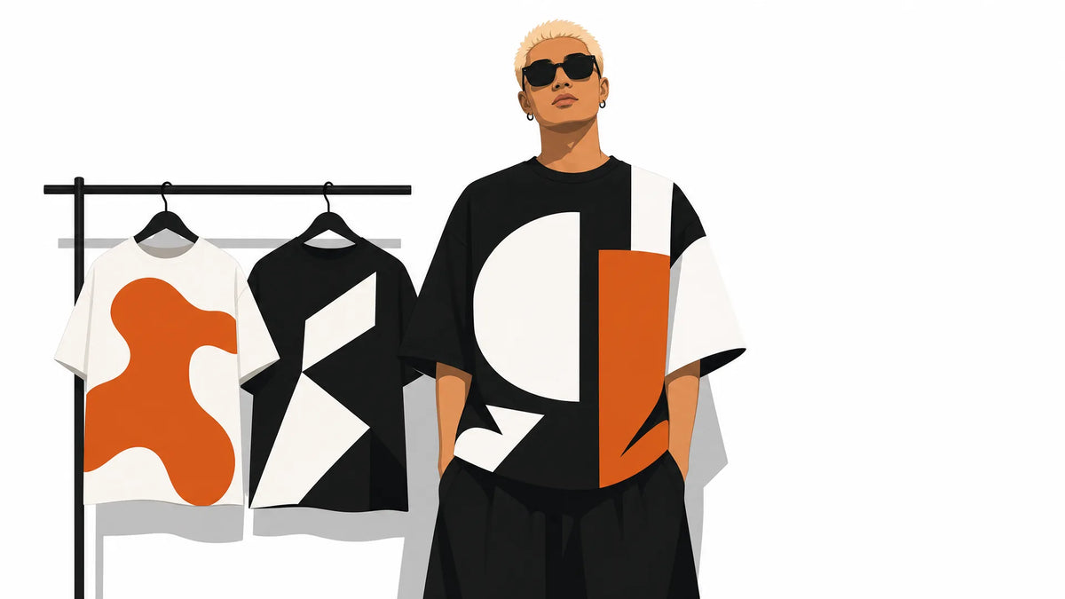
High contrast is not optional on a wearable canvas. Designs with low contrast between graphic and garment color disappear in low light and read as muddy from ten feet away. Treat the garment color as an active design element, not a neutral background. A dark navy shirt absorbs low-contrast details; a white tee shifts how transparent layers render under DTG ink.
Scale up. Elements that look bold on a 1080px screen preview often read as small on an actual chest. Push your focal graphic larger than feels comfortable on screen, it'll look right on fabric. Text especially: below roughly 1-inch printed height, legibility suffers on a garment in motion.
Designing for oversized graphic hoodies covers how scale decisions change when the canvas itself is intentionally large.
Designing for All-Over Print Apparel
AOP rewards bold, repeat, or wraparound compositions, which is exactly why we build for it. A single centered chest graphic on a full-garment print template is a wasted opportunity.
Think about the design as a surface, not a placement. Repeat patterns, large-scale illustrated fields, and compositions that deliberately wrap from front to back all use the AOP format the way it's meant to be used. Psychedelic all-over print as a design inspiration is a strong reference point for how bold pattern logic plays out on a real garment.
If you're building music-influenced graphics for creating music-inspired graphics for custom tees, the same contrast and scale rules apply, the graphic either owns the space or it doesn't.
Browse our all-over print apparel to see these principles in finished form.
POD Design Best Practices: Common Mistakes and How to Dodge Them
Here are the errors that kill otherwise good designs, and the fix for each:
Low-resolution files. Designing at 72 DPI for web and uploading it for print is the most common mistake. Always create at 300 DPI at the actual print dimensions from the start.
No transparent background on DTG files. A PNG with a white background on a colored garment prints with a white rectangle around the design. Export DTG graphics as PNG with a true transparent (alpha) background.
Over-relying on gradients for DTG. Fine, smooth gradients that look perfect on screen can band or break up on DTG, especially on dark garments where the underbase complicates how ink layers. Test gradients on a mockup and simplify them when in doubt.
Ignoring the garment color. Designing on a white canvas in Illustrator, ignoring the actual shirt color, produces designs that look wrong on the final product. Preview your design on a mockup in the actual garment color before uploading.
Failing to proof on a realistic mockup. Platform mockups aren't perfect, but they catch gross errors, a design that's too small, a graphic that cuts off at the hem, text that's illegible at garment scale. Use the mockup every time, not as an afterthought.
Ignoring seam positions on AOP. Placing a face or a key focal graphic directly over a shoulder seam or sleeve attachment point guarantees it'll be cut in half on the finished garment. Template-first design prevents this.
Statement tee concepts for artists and creators shows how concept and technical execution connect, because a great idea still needs to survive the file prep process.
From Design File to Finished Product: The Design-to-Print Pipeline
Understanding the full pipeline helps you catch problems at the right stage instead of after production.
- Design creation. Work in the correct color mode, at the correct resolution, inside the correct garment template. This is where all technical decisions are made.
- Mockup review. Place the design on a realistic garment mockup. Check scale, contrast, seam positions, and garment color interaction. Fix issues here, not after production.
- File export. Export in the correct format for the print method: PNG with transparency for DTG, high-res PNG or PDF for AOP. Confirm resolution at export.
- Platform upload. Upload to your POD platform and use their built-in previewer as a second check. Most platforms flag low-resolution files at this stage.
- Print production. The platform handles printing and fulfillment. File quality determines outcome, no adjustments are possible once production starts.
- Quality check. For your own store or brand, order a sample run before listing publicly. What looks right on a mockup occasionally needs a contrast or scale adjustment on an actual garment.
The advantage of POD is no inventory risk, you're not committing to a production run until a design is proven. That's exactly why how POD print quality holds up over time matters: the design-to-product pipeline only works if the finished garment holds up wash after wash.
Make the file right. Proof it properly. Then let the product speak.

Leave a comment
This site is protected by hCaptcha and the hCaptcha Privacy Policy and Terms of Service apply.