
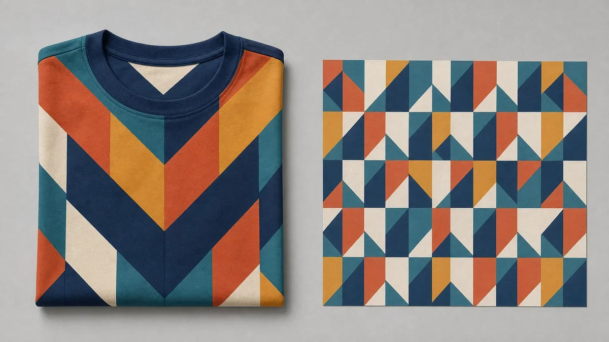
Bold Patterns All-Over Print Tees Design Guide
If you've searched for bold patterns all-over print tees recently, you already know the problem. The results are flooded with low-effort repeats, washed-out colors, and designs that look like someone tiled a flat image onto a shirt and called it done. Most of it blends together, which is the exact opposite of the point. We build for people who refuse that. Taking full-coverage design seriously means starting at the first pixel and finishing at the garment.
Why Most All-Over Print Tees Fall Flat (And What Sets Bold Ones Apart)
The market is full of full coverage print tees that technically cover the whole shirt but don't actually do anything. Low-contrast color palettes. Patterns that awkwardly break at the seams. Compositions that looked fine on a flat screen but lose all coherence once they hit a three-dimensional body.
The issue isn't the printing, it's the design thinking upstream. Most sellers treat the garment as a rectangle and tile a graphic across it. That approach ignores seam placement, body panels, shoulder curves, and how the fabric drapes in motion. The result is a shirt that looks busy without being bold.
Truly bold all-over graphic patterns are designed for the garment, not around it.
The Difference Between Slapping a Graphic on a Shirt and Real Pattern Design
All-over print succeeds when the pattern is engineered for the garment's panels, accounting for seam placement and body movement, rather than tiled from a flat file.
That engineering shows. A well-designed all-over print tee has intentional scale: the repeat isn't so small it reads as noise or so large it gets sliced awkwardly at the hem. Color transitions feel deliberate across front and back panels. Seam breaks are worked into the composition, not treated as accidents. That's the bar. Most product on the market doesn't clear it.
What Makes Full Coverage Print Tees Visually Immersive
A great all-over graphic pattern isn't just coverage, it's a composition. Three design mechanics separate immersive apparel prints from generic filler: repeat logic, scale, and color contrast.
Pattern Composition: Repeat, Scale, and Density
A repeat is how a pattern tile maps across the fabric. The main types:
- Straight repeat, tile stacks directly. Clean, structured, tends to read formal.
- Half-drop repeat, each column is offset by half a tile height. Creates diagonal flow, more dynamic.
- Mirror/reflection repeat, tiles flip on an axis. Produces symmetrical, kaleidoscopic results that dominate the intricate print designs category right now.
Scale is equally critical. A micro-repeat can look like texture from a distance but rewards close inspection. A macro-repeat makes a single loud visual statement. The best all-over prints use scale intentionally, not just "big" or "small" but calibrated to how the shirt reads across a room versus up close.
Density, how much of the base fabric shows, controls visual weight. A dense, high-coverage pattern signals confidence. A sparse one needs strong individual motifs to compensate. Neither is wrong; both need intent.
Color Contrast and the Logic of Bold Repeating Patterns
Bold repeating patterns live and die by contrast. Not just light-versus-dark, but hue contrast, temperature contrast (warm against cool), and saturation contrast (vivid against muted). A pattern with four colors that all sit in the same tonal range reads as flat. Add one high-saturation pop against a desaturated field, and the whole design activates.
The practical rule: pick a dominant color, a subordinate color, and an accent that creates tension. Run that logic across the full garment and the print holds its own as a wearable piece rather than a decorative blur.
All-Over Print Techniques: How Full Coverage Print Tees Are Made
Dye-Sublimation vs. Direct-to-Garment for All-Over Graphic Patterns
Two main print methods power the full coverage print tees market.
Dye-sublimation uses heat to convert ink into gas, which bonds directly into polyester or poly-blend fibers. Because the ink becomes part of the fabric rather than sitting on top, colors stay vivid through repeated washing, no cracking, no fading, no flaking. It's the dominant method for edge-to-edge all-over prints and produces the most accurate color reproduction for complex, immersive apparel prints. The tradeoff: it works best on synthetic fabrics (typically 100% polyester or high-poly blends), so fabric hand feel differs from a 100% cotton tee.
Direct-to-garment (DTG) printing sprays ink directly onto the fabric, it works on cotton and natural blends, which feel softer. DTG can achieve high detail but historically struggles with edge-to-edge consistency at the seams and hemlines. Advances in DTG technology have narrowed the gap, but dye-sublimation remains the standard for true full-bleed bold patterns all-over print tees.
Print-on-demand fulfillment means each tee is produced only when ordered, no overstock, no unsold inventory, which allows independent brands to offer a wider range of intricate, niche designs than traditional wholesale models permit. That production model is directly why print-on-demand designs built for retail quality can carry bold, complex compositions that a bulk-inventory buyer would never risk ordering. And print-on-demand apparel durability holds up, dye-sub ink embedded in the fiber outlasts screen-printed alternatives on repeat washings.
Bold Pattern Aesthetics Worth Knowing in 2026
Pattern Styles That Dominate Right Now
Psychedelic and maximalist all-over prints have moved from festival-wear niches into mainstream streetwear drops in 2026, appearing across independent POD brands and larger retailers alike. Here's what's driving the conversation:
Maximalist/psychedelic, Saturated color fields, warped geometry, optical illusion structures. These are shirts that look like they're moving. For people who consider their clothing a mood broadcast, nothing lands harder. Dive deeper into psychedelic and immersive print apparel if this direction speaks to you.
Nature-repeat and botanical, Dense floral fills, jungle scenes, insect grids. Not the gentle garden-party kind, the high-contrast, pattern-wall kind that reads aggressive even with natural subject matter.
Abstract geometric, Interlocking shapes, tessellations, hard-edge color blocking across panels. These work especially well with dye-sublimation because color edges stay sharp and precise.
Anime and manga-influenced, Panel-style illustrations looped across the full garment, character motifs built into the repeat. This aesthetic carries serious cultural signal for a specific audience, which is exactly what wearable identity dressing is about.
Glitch/digital artifact, Corrupted pixel aesthetics, scan-line breaks, error-screen palettes. Feels current in a way that speaks to visual culture beyond just apparel.
Each of these aesthetics works because it signals something specific about the person wearing it. That's the actual point of bold all-over graphic patterns, not just coverage, but communication.
How to Wear Bold All-Over Print Tees Without Overthinking It
Short answer: don't overthink it. The print is the outfit.
A few rules that actually work:
Let it lead. The tee is the anchor piece. Everything else, pants, shorts, outerwear, goes neutral. Black, grey, white, denim. The bolder the pattern, the simpler everything else needs to be.
Fit matters more than usual. An all-over print on a boxy fit reads intentional. The same print on something too tight or too long fights the composition. Know which silhouette works with your body and commit to it.
Layer with restraint. An open solid-color overshirt or coach jacket works if you want to break the visual intensity, but only one layer, unbuttoned. More than that kills the print.
Footwear: clean or contrasting. White sneakers read as deliberate against a loud print. Bold footwear can work but takes confidence. Avoid patterned shoes, two patterns fighting each other is noise, not style.
Skip the accessories competition. One chain, one ring, one watch, max. Let the tee carry.
If you're building out a full look, the same logic applies to heavier statement pieces. The all-over print hoodie design tips article covers how that transitions into a layered look without the pattern fight.
For those exploring the wider bold graphic tees for men space, the same anchor-piece logic applies across the category, statement tees work when the rest of the look steps back.
Shop Bold Patterns All-Over Print Tees That Actually Make a Statement
If you've made it here, you're not shopping for a safe choice. You want something that looks like it was designed, because it was.
At Tenino Ventures, every all-over print tee is built as a full-garment composition. Pattern scale, color blocking, and repeat logic are decided at the design stage, not cropped from flat artwork after the fact. Every piece is produced on demand, which means every design in the lineup earned its place because of what it looks like, not because we needed to fill a minimum order.
These are bold patterns all-over print tees for people who treat their clothing as a visual statement. Wearable art for people who find "minimalist" boring. If that's you, browse our full lineup of graphic tees and find what hits.
If you're a creative who thinks in visuals, the statement tee concepts for creative types article breaks down the aesthetic directions that connect art-brain thinking to wearable pieces worth owning.
We don't make filler. We make stuff for people who stand out. Come find yours.

Leave a comment
This site is protected by hCaptcha and the hCaptcha Privacy Policy and Terms of Service apply.