

Graphic Tees for Niche Communities: Design Guide
A generic tee design gets scrolled past. A tee that nails a specific community's inside language gets bought, worn, and photographed at the next meetup. That's the gap most design advice ignores. If you're figuring out how to design graphic tees for niche communities, the rules are almost the opposite of what works for a mass-market brand: less polish, more specificity, and a willingness to design for a smaller, sharper audience instead of everyone.
Why Generic Design Advice Fails Niche Communities
Most graphic tee tutorials assume you're designing for a broad demographic, "millennials," "streetwear fans," "gift shoppers." That approach falls apart the moment your audience is a tight-knit fandom, an online subculture, or a hyper-specific hobby group. These communities have already built their own visual shorthand. They know instantly when a design comes from someone who actually gets it. They know just as fast when it doesn't.
What Makes Subculture Apparel Different From Mass-Market Tees
Mass-market design optimizes for broad appeal. It smooths out edges so nobody's offended and everybody kind of likes it. Subculture apparel does the opposite. It sharpens edges on purpose. A design for a niche community doesn't need to make sense to outsiders. It needs to make total sense to insiders.
That's why authenticity beats polish in this space. A rougher design with the right in-joke or symbol will outperform a beautifully rendered graphic that misses the reference entirely. Communities reward specificity. They punish anything that feels like it was made by an outsider skimming a trend report.
Understanding the Culture Before You Design a Single Line
You can't design for a community you haven't studied. This sounds obvious, but it's the step most people skip. They jump straight to Photoshop instead of doing the homework first.
Where to Actually Study a Community's Aesthetic
The real research happens where the community actually hangs out: Discord servers, subreddits, niche forums, fan Twitter/X circles, conventions, meetups. Lurk before you design anything. Read the pinned posts. Notice what gets upvoted, what gets mocked, and what phrases show up in every third comment.
This kind of immersion is what separates designers who nail niche community graphic tee design from those who produce something technically fine but culturally off. Designers who embed themselves in a community's Discord, subreddit, or forum before sketching tend to catch the nuances outsiders miss, which memes are already dead, which symbols are sacred, which are overused.
Spotting the Symbols, Memes, and In-Jokes That Matter
Not every meme is worth putting on a shirt. Some references are already stale by the time they're popular enough for outsiders to notice. Others are considered overused within the community itself, the equivalent of a dad wearing a slang term two years too late.
Track which symbols keep recurring across fan art, pinned threads, and merch the community already loves. Note the difference between a joke that's currently alive and one that's become a cringe reference. This distinction matters more than any font choice you'll make later.
Building a Visual Language for Subcultures Apparel
Once you understand the culture, you need to translate it into visual decisions. This is where designing for subcultures apparel becomes a craft of its own, distinct from general graphic design.
Typography, Color, and Iconography Choices That Signal Belonging
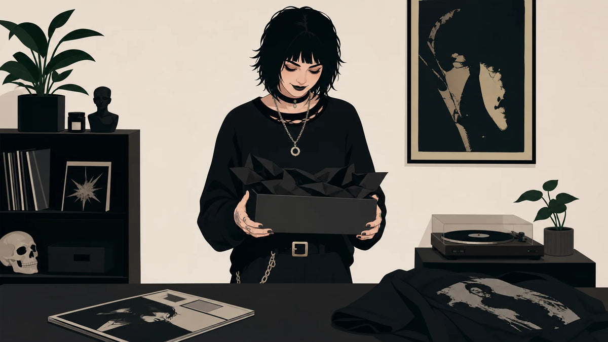
Subcultures like goth, skate, anime fandom, and gaming communities each carry their own visual grammar, typography, color palettes, and iconography that signal belonging the moment someone spots them across a room. Jagged blackletter and high-contrast monochrome read as goth. Chunky, hand-scrawled type and grime textures read as skate. Bold outlines and saturated palettes borrowed from key art read as anime fandom. Pixel fonts and neon-on-dark schemes read as gaming.
These aren't arbitrary style choices. They're insider signals. Get them wrong, say, a soft pastel palette on a design meant for a hardcore gaming crowd, and the design reads as fake no matter how clean the execution is. If you want a deeper look at how this plays out for one of these groups specifically, an aesthetic apparel built for gaming communities breakdown shows how far typography and color alone can carry a design's credibility. The same logic applies to anime, where anime fandom aesthetic in wearable form has its own visual conventions worth studying before you sketch a single line.
Designing Community-Specific Shirts Without Crossing the Line
This is the part generic design advice never covers, and it's where good intentions can still produce a bad, or offensive, result. Learning how to design community-specific shirts means learning where the lines actually are.
Cultural Appreciation vs. Appropriation in Fandom Merch
Before you finalize a design, run it through a few honest checks. Is the symbol you're using sacred or ceremonial to a culture, rather than just a stylistic motif? Is the joke punching down at a marginalized group within or adjacent to the community? Are you profiting off a closed or insular culture without giving anything back to the people who built it?
None of these questions have a universal yes-or-no answer. But asking them before you print is the difference between graphic tee design for fandoms that feels like a tribute and merch that feels like exploitation. If a symbol carries real weight, religious, cultural, or deeply personal to a specific group, treat it with more caution than a meme that started as a joke.
When and How to Get Community Input Before You Print
If you're not deeply embedded in the community yourself, get feedback from people who are. Post a concept in a relevant Discord or subreddit (with permission from moderators where required) and ask directly: does this land, or does it feel off? Community members will tell you fast, and often bluntly, if something feels appropriative or just wrong.
This isn't about outsourcing your creative judgment entirely. It's about catching blind spots before a few hundred shirts go out into the world carrying a mistake the community would have flagged in five minutes.
Creating Inside-Joke and Reference-Heavy Tee Concepts
Some of the best subculture merch works because it doesn't explain itself. Fandom fan-art communities on platforms like Etsy and Redbubble have built entire micro-economies around inside-joke shirts that only make sense to people inside the fandom. The design "clicking" instantly for insiders is the whole point. If someone outside the community has to ask what it means, that's not a bug. That's the design doing its job.
Turning a Running Bit Into a Wearable Design
Start with the reference exactly as the community uses it: the specific phrase, the specific pose, the specific in-joke wording. Don't smooth it out or add explanatory text to make it more accessible to outsiders. That instinct kills the design's credibility.
Instead, focus on visual translation: turn a recurring phrase into bold, minimal typography. Turn a running character bit into a small, iconic illustration rather than a busy scene. The goal is a design simple enough to read at a glance, but specific enough that only insiders get the full punchline. This "you get it or you don't" quality is the kind of bold self-expression that resonates with people who refuse to blend in. For more ways to push a niche concept toward a finished, wearable design, turning niche concepts into statement tee designs walks through the process from raw idea to print-ready graphic.
Testing Your Designs With the Community Before You Print
Even after research, cultural checks, and careful visual translation, you won't know for certain if a design lands until the community sees it. That's why testing matters as much as designing.
Low-Risk Ways to Validate a Niche Design Idea
Soft-launch the concept before committing to production. Share a mockup in the community itself, a relevant subreddit, Discord, or fan group, and gauge the reaction. Are people tagging friends? Asking where to buy it? Or is the response lukewarm and polite, which usually means it missed?
Niche and micro-community apparel tends to sell in smaller, more predictable bursts than broad-appeal designs. That's part of why print-on-demand production, rather than bulk runs, fits subculture merch so well. Tenino Ventures operates on a print-on-demand model, which removes the inventory risk of testing a niche design before knowing if a tight-knit community will embrace it. You can put a concept out, see how it performs, and adjust without sitting on hundreds of unsold shirts. This approach to testing designs through print-on-demand production is especially useful when you're not sure a design will resonate until real community members have seen it in the wild.
Designing for niche communities is a different discipline than designing for the masses. It rewards research, restraint, and respect over broad appeal. If you're drawn to authentic subculture style over trends rather than chasing whatever's mainstream this season, that same principle extends to music-driven fandoms too, where designing music-inspired graphics for fan communities follows a similar playbook of research, symbols, and insider language. When you're ready to see how these principles show up in finished product, browse bold graphic tees built for standout personalities and see what designing with a specific tribe in mind actually looks like.


Leave a comment
This site is protected by hCaptcha and the hCaptcha Privacy Policy and Terms of Service apply.